
Overview
Rebel Fitness Club is a branding concept for a gym in Casablanca: a brand identity I designed in 2020, then extended in 2026 into a launch campaign that takes the brand to 10 cities in Germany.
I worked on it alone, from the first sketch to the last banner. In 2020 that meant the logo, the flame symbol, colour, typography and the first brand applications. In 2026 it meant the campaign idea, the copy, three key visuals, out-of-home, Instagram, Twitch and display. The campaign phase took three weeks.
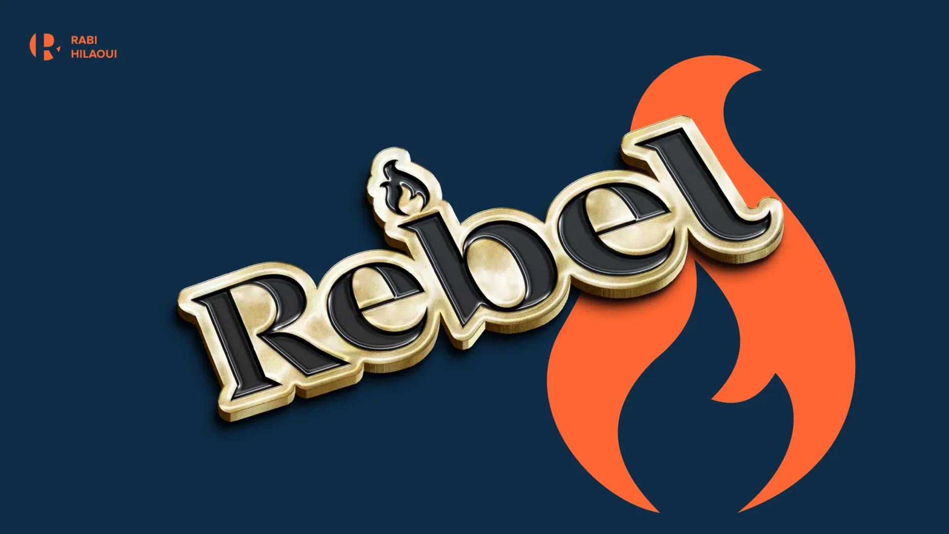
Rebel, 2020
Gym brand identity
A gym brand that feels confident, not aggressive.
Rebel started as a fitness and weightlifting club in Casablanca, built around a team of experienced coaches and modern equipment. Most gyms in the city speak the same visual language: heavy black type, red and chrome. Rebel needed to stand apart from them, and to look as good on a training shirt as on the sign above the door.
So instead of the usual condensed sans, I drew the name in a sharp serif. It gives Rebel a voice with character, closer to a fashion label than a supplement brand. A small flame sits on the stem of the "b" like a torch: the spark of someone deciding to start. Two colours carry everything: Rebel orange (#F46231) for energy and navy (#0E2C46) for discipline, with warm white and black as quiet neutrals.


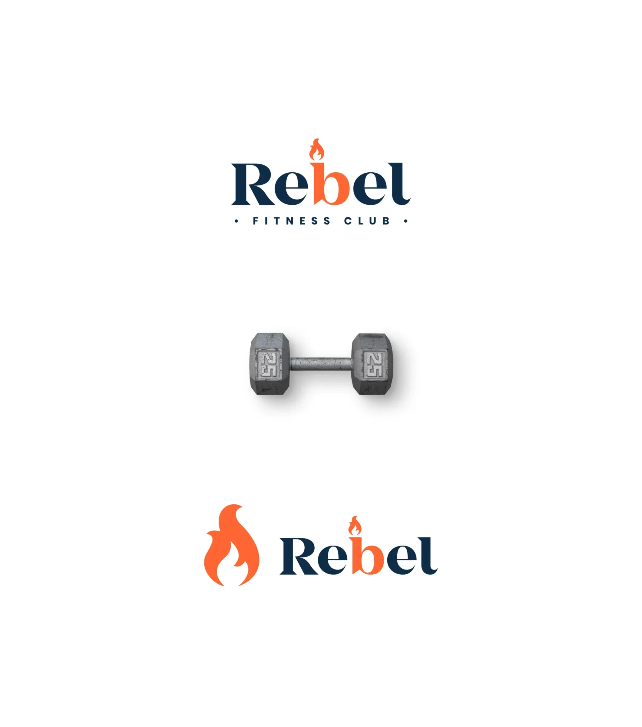
Logo, colour versions and lockups
Logo system
One wordmark, one flame, four ways to use them.
Primary logo: the wordmark with the "Fitness Club" descriptor, for signage and first contact.
Wordmark: "Rebel" on its own, once people know the club.
Flame symbol: for app icons, social avatars, merchandise and equipment.
Outline versions: for embossing, tone-on-tone print and large patterns.
The flame scales from a 16-pixel favicon to the side of a building. Blown up, it becomes a graphic stage of its own: a shape that frames the athletes in every later visual.
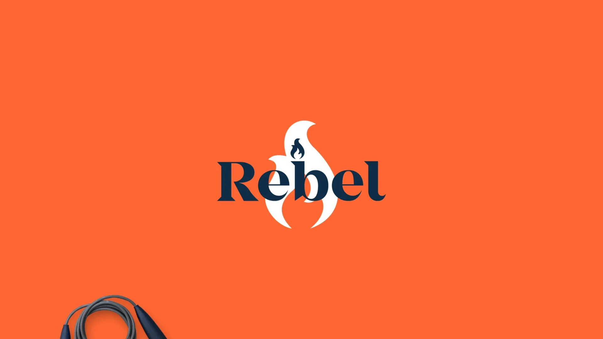
The flame, scaled up
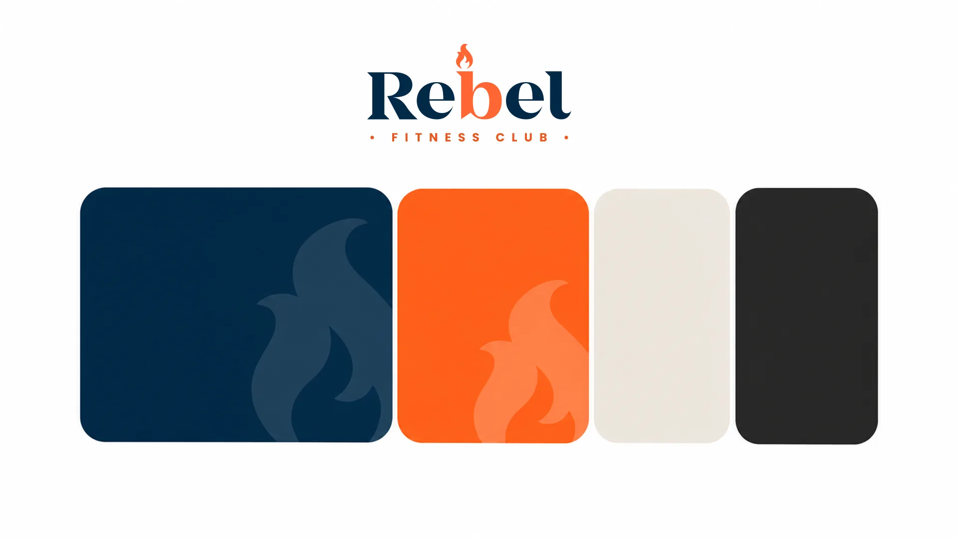
Colour palette
Brand in use
Built to be worn, carried and lived in.
A gym brand lives on bodies and objects more than on screens. Training tops carry the flame on the chest, bottles run the wordmark vertically, and the studio follows the same rule as the photography: navy walls, one orange light. The first applications from 2020, an orange training shirt and a pair of bottles, already set the tone, with the flame as a big, confident shape cut by the navy.
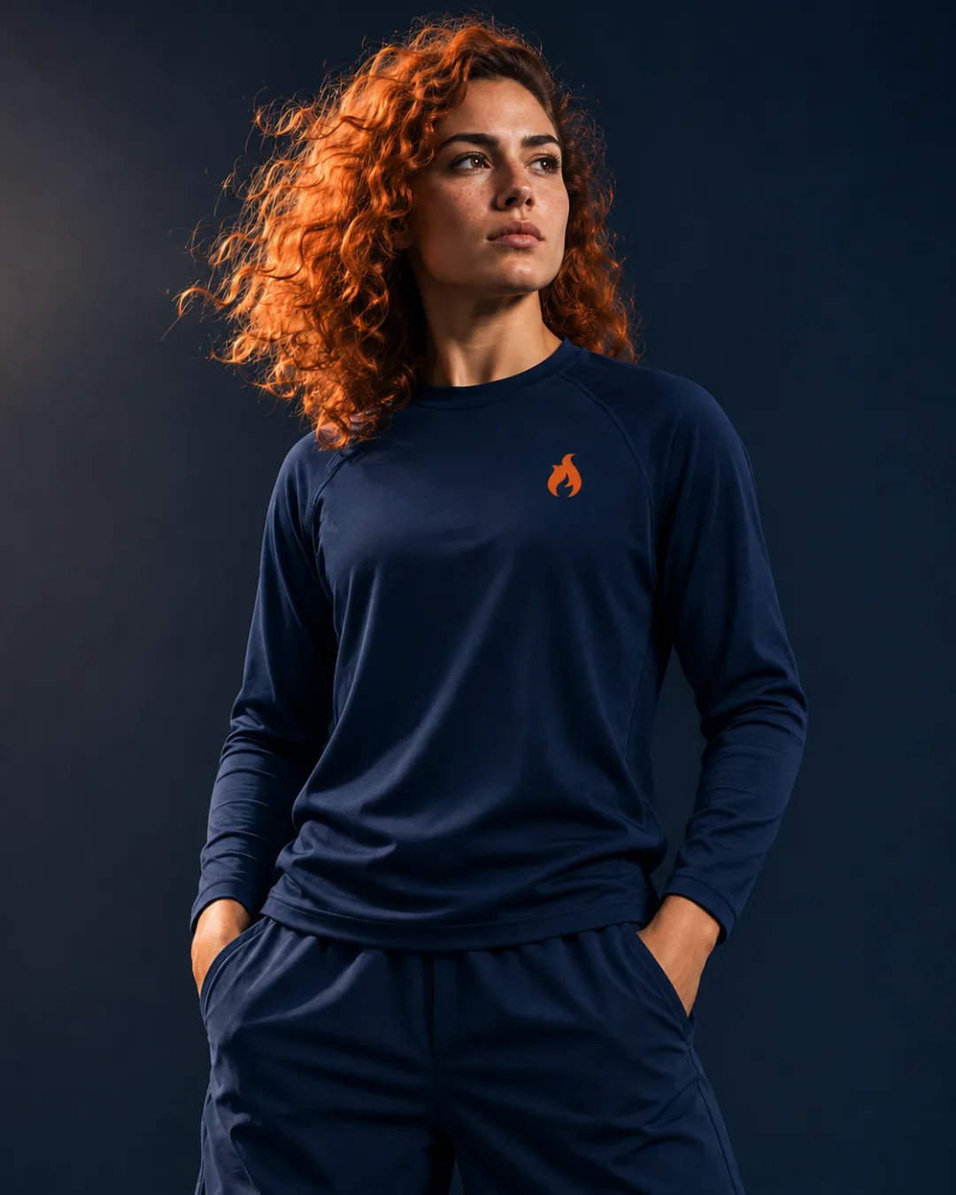


Apparel and gear
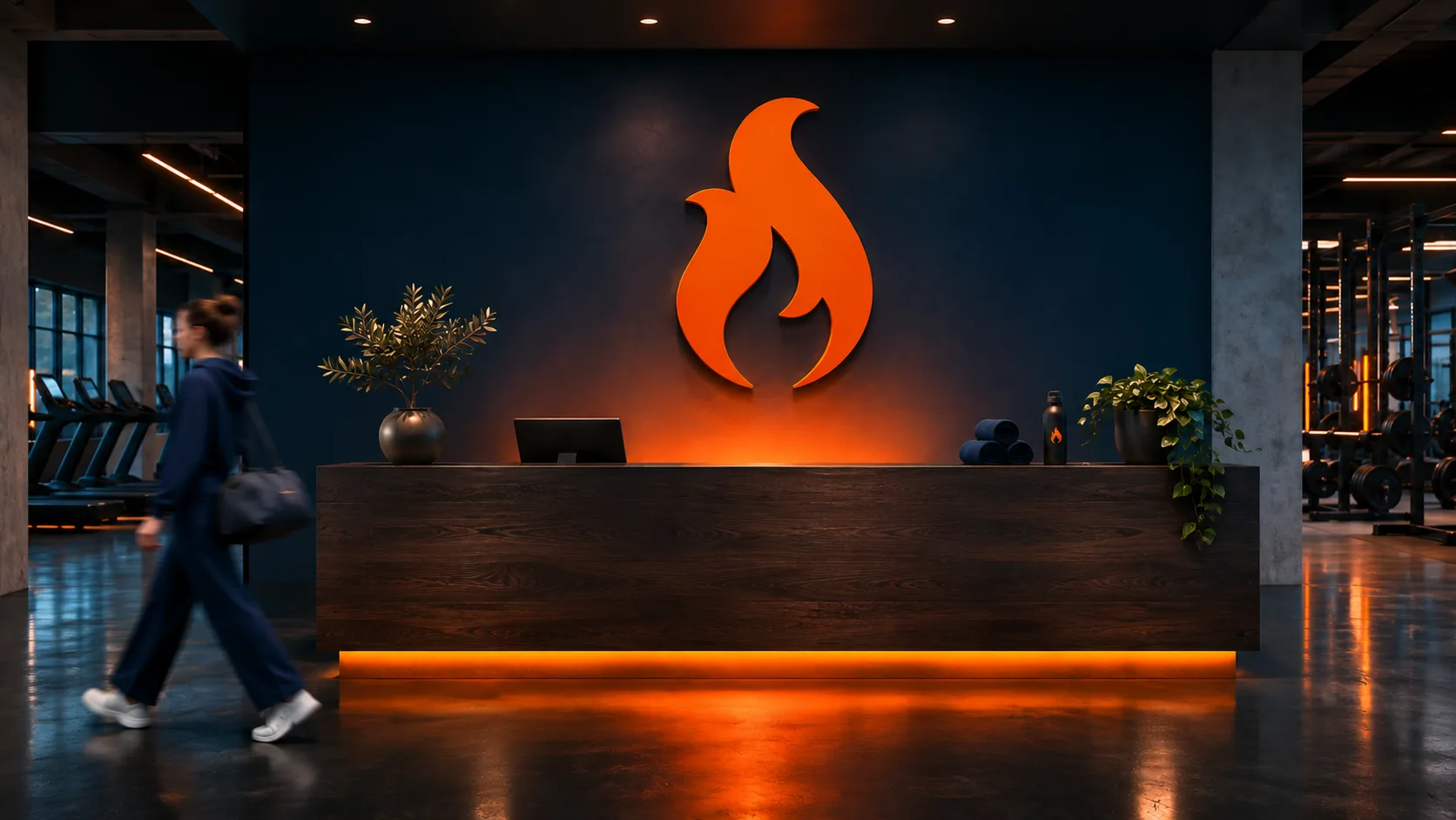
The studio: navy walls, one orange light
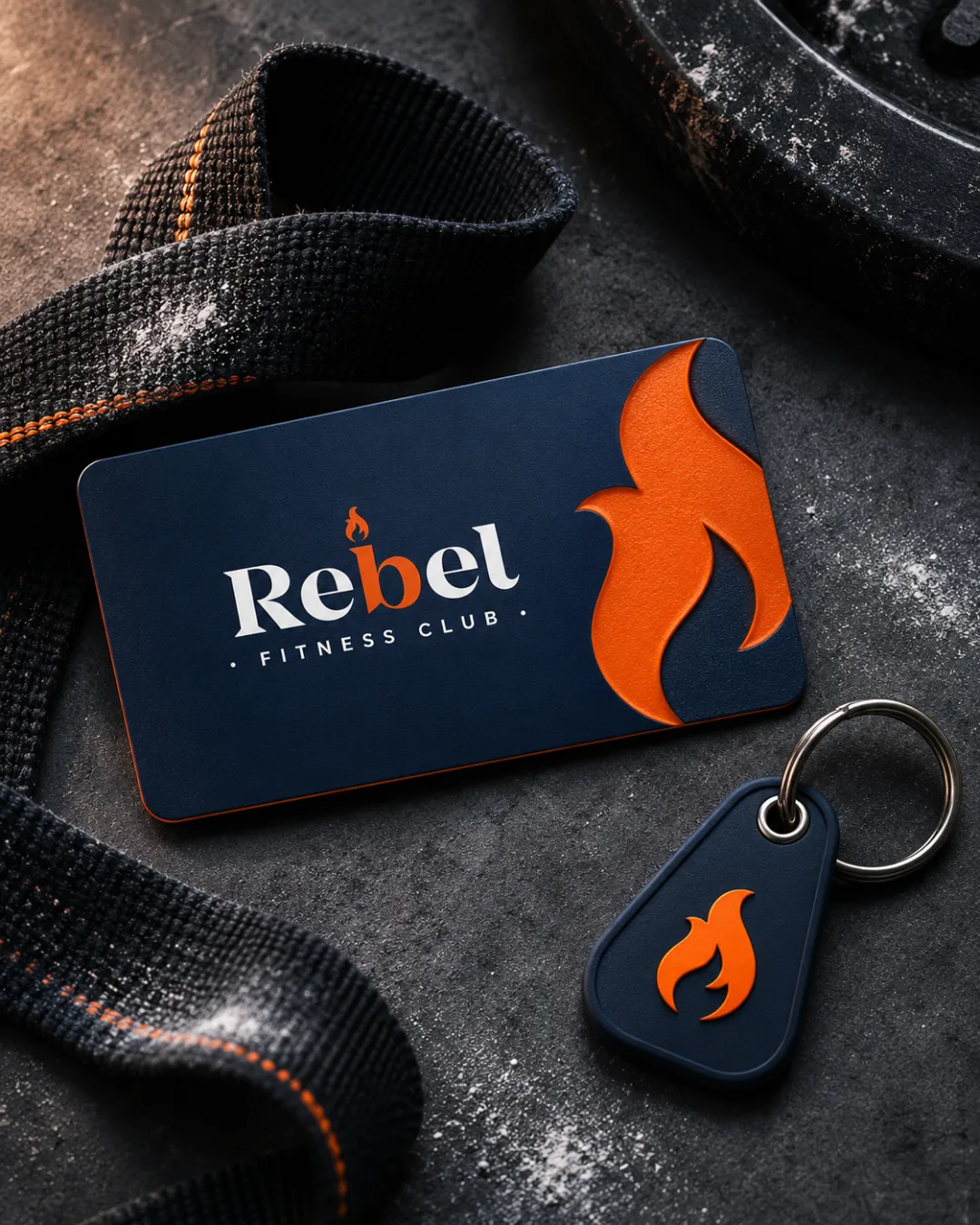
Membership card & key tag
The first thing a new member holds. Navy, an embossed orange flame and nothing else: the brand doesn't need to shout once you're inside.

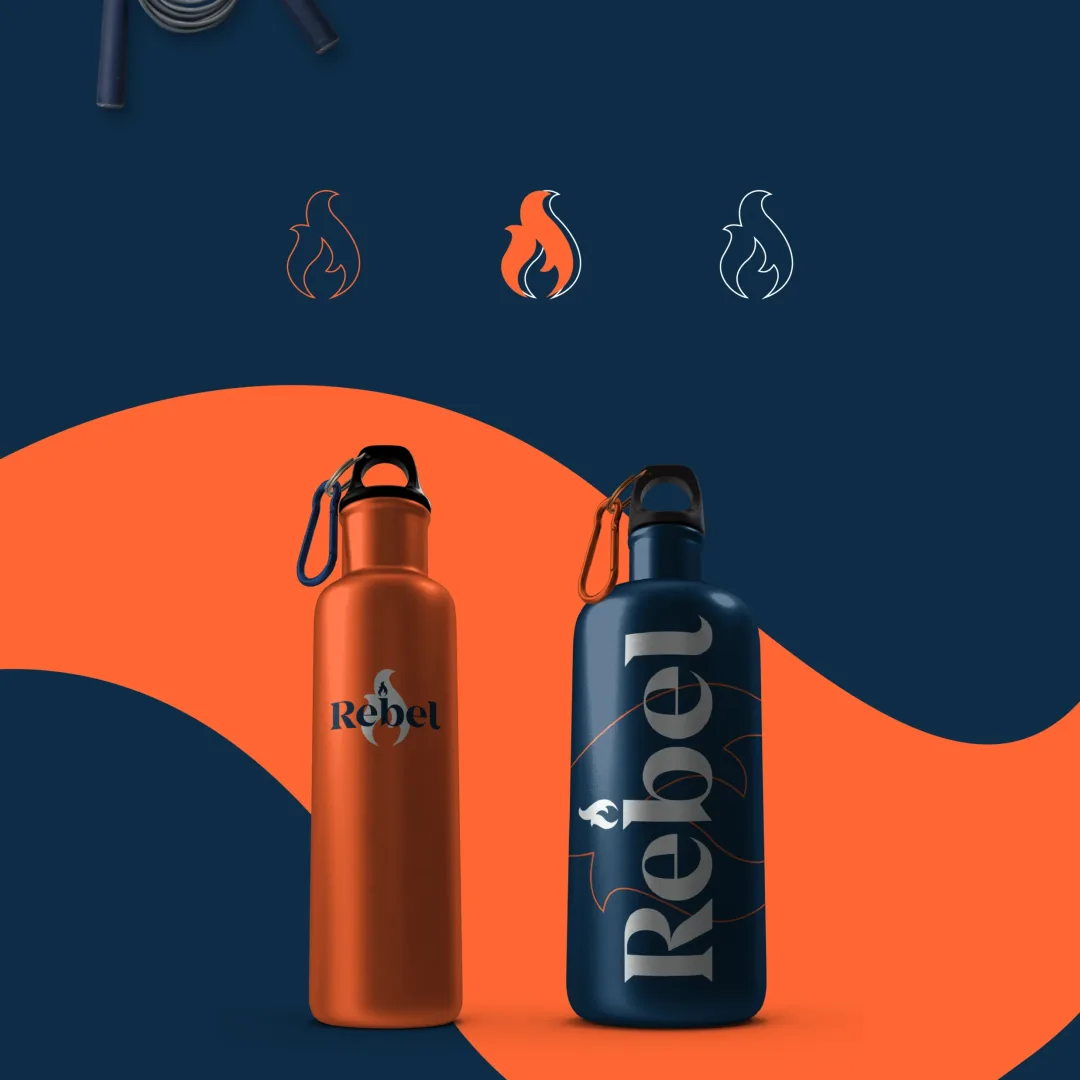
First applications, 2020
Germany launch campaign
The 2026 brief: launch Rebel in 10 German cities and sell one offer in a single month.
In this concept, Rebel opens 10 studios from Hamburg to München on 1 December. The offer is to train for 12 months and pay for 8, only until 31 December. The goal is 1,000 membership contracts by the end of the year, through Instagram, the Rebel Germany website, out-of-home at bus and train stops in three cities, and Twitch.
The problem was obvious: December is the month nobody joins a gym. Everyone waits for January and a New Year's resolution. A brand called Rebel shouldn't wait.
“Vorsätze sind für Januar. Rebellen starten im Dezember.”— Campaign line: “Resolutions are for January. Rebels start in December.”
Key visuals
Three athletes, one photo rule.
Every key visual follows one system built from the 2020 identity: a navy studio and one orange object, the serif headline on an orange bar, and the flame scaled up behind the athlete. A "Neu in Deutschland" sticker gives instant awareness, and the offer and dates always sit in the same place, so the sale is never hard to find.
Strength is shot from above, like Rebel's equipment photos: she looks up, and you look in. In Fight, the glove breaks the frame. Speed uses motion blur and a single orange accent.
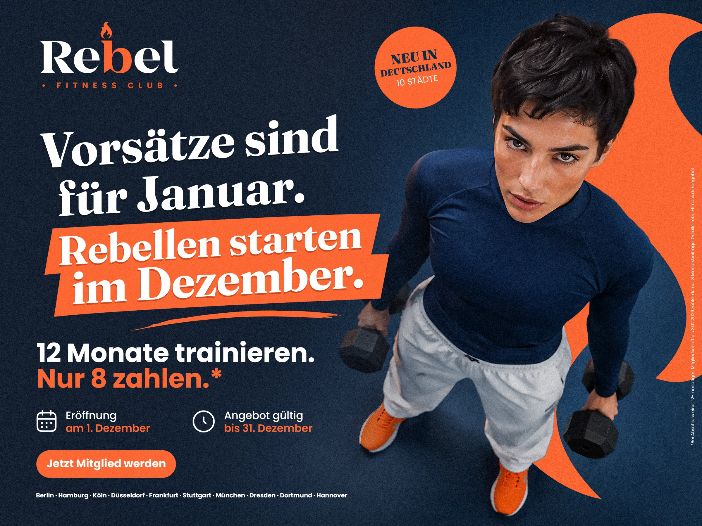
Key visual 01 · Strength
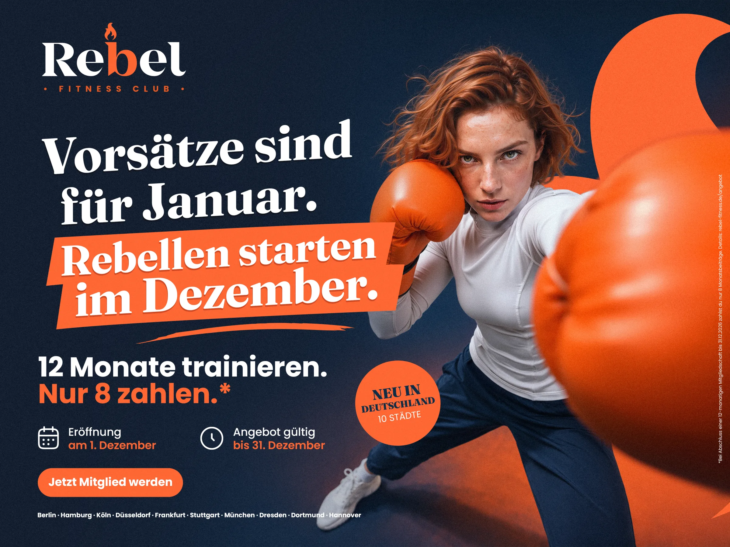
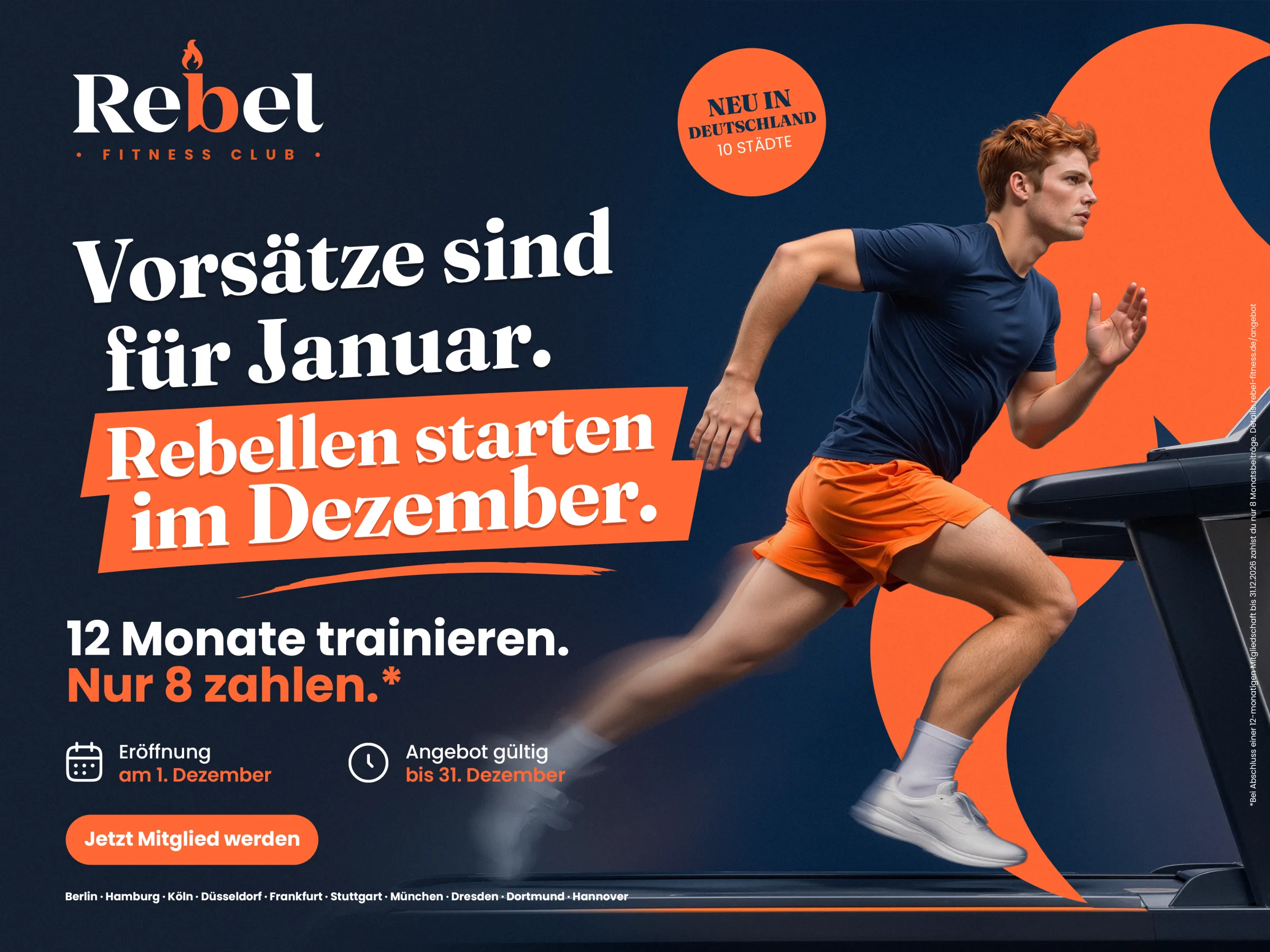
Key visuals 02 · Fight and 03 · Speed
Out of home
Three cities, one look.
Posters at bus and train stops in Hamburg, Berlin and München carry the launch, and every studio opens wrapped in the campaign: the façade is the fourth poster. Off the main grid, the München street poster drops the offer and keeps only the attitude and one address.
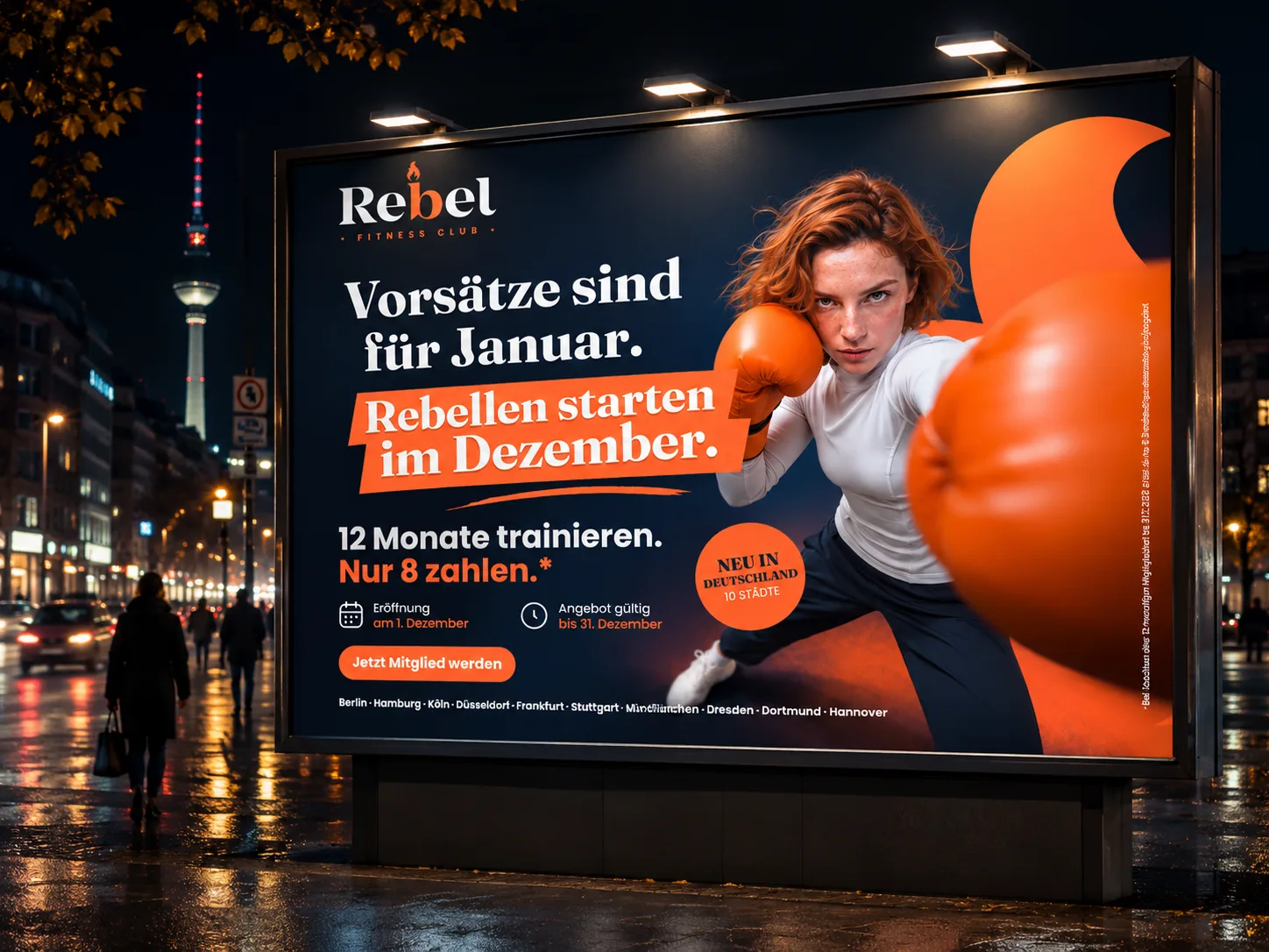
Berlin · city billboard

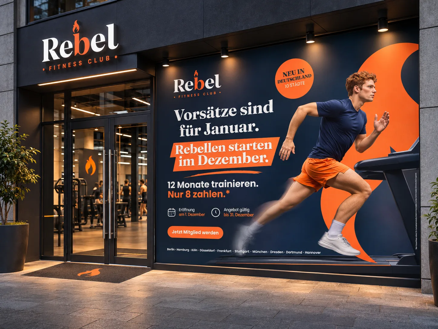
Hamburg · U3 Rathaus, and a studio façade

München · street poster
No offer, no dates: just the line, the athlete and the address.
Instagram & Twitch
Tease. Launch. Explain.
A city teaser starts on 20 November ("Etwas brennt in Hamburg"), the launch post lands on 1 December, and an offer carousel explains 12 = 8 in one swipe. Stories stay local and swipe-ready: how the offer works, one story per city and all 10 cities in one frame, each a single tap from signing up.
On Twitch, Rebel speaks the audience's language: "Respawn im Rebel" and "Level up IRL". Streamers host a short "Rebel Break" workout live, with the offer on screen, and the code TWITCH12 makes every Twitch contract trackable.
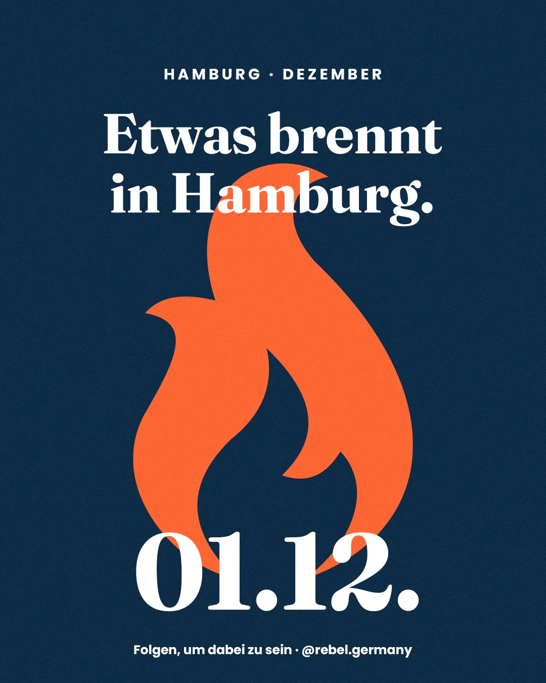
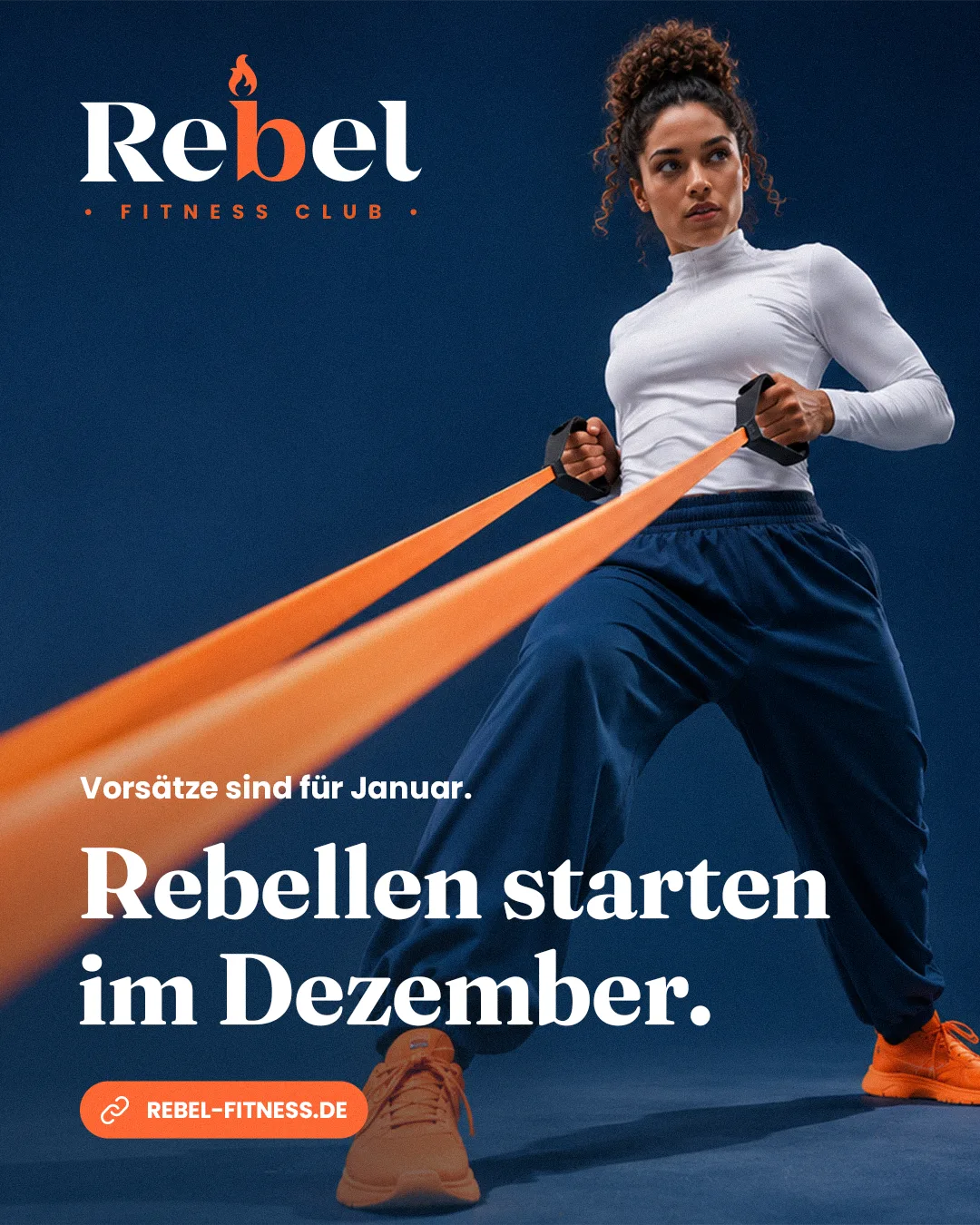

Feed: teaser from 20.11., launch on 01.12., offer carousel


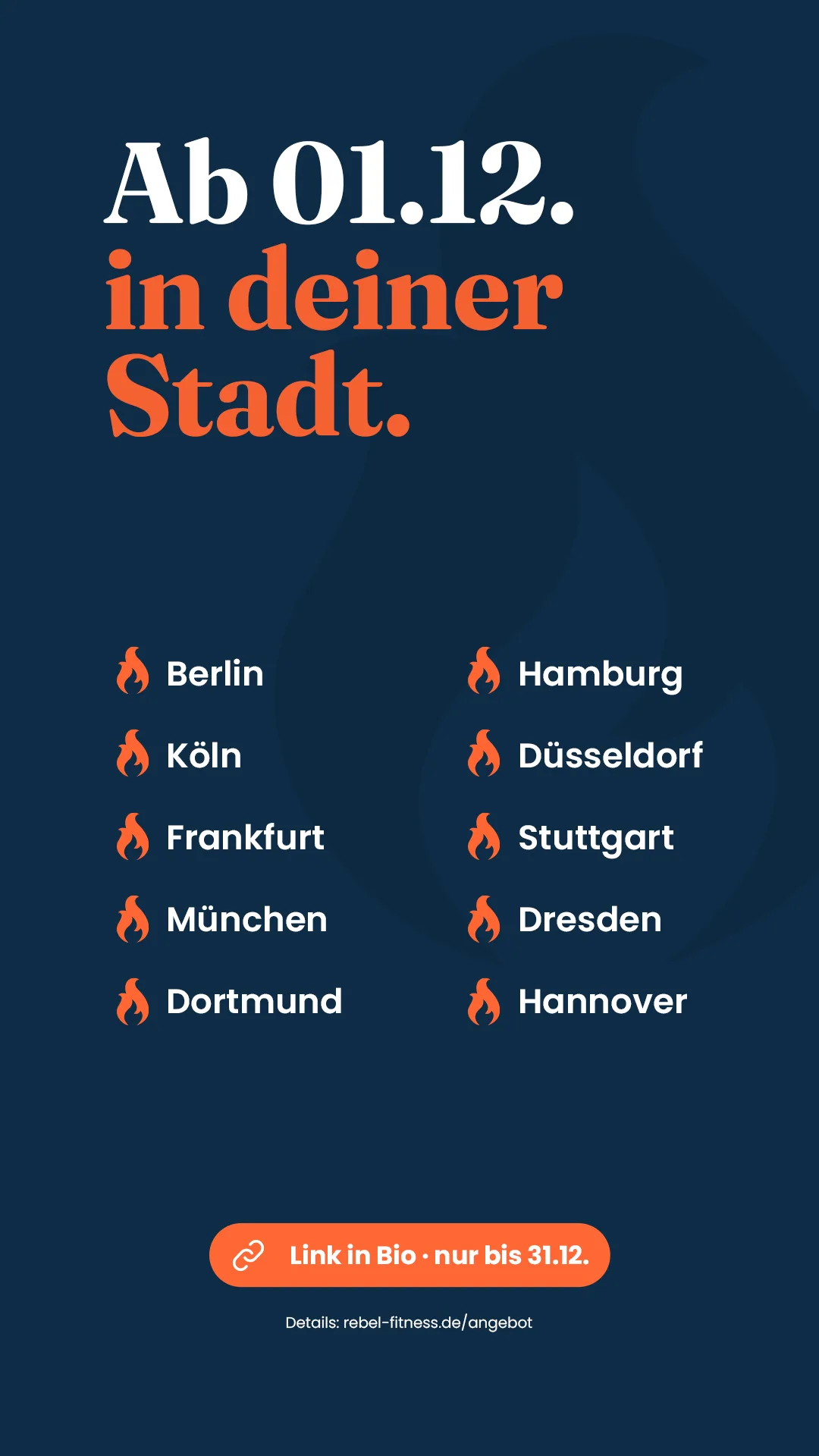
Stories: how it works, city story, all 10 cities

Respawn im Rebel.
Gamer words with Rebel attitude, and one code to track every sign-up from Twitch.
Display & website
The offer follows them to the website.
A medium rectangle and a leaderboard in the same system. Each one lands on the Rebel Germany site: studio finder, offer and a countdown to 31 December.
Rollout plan
From awareness to 1,000 contracts, in four beats over six weeks.
Awareness: a new brand in 10 cities, carried by OOH, city teasers and the "Neu in Deutschland" sticker.
Offer: 12 = 8, shown the same way everywhere. The 31 December deadline creates the urgency.
Contract: one action on every touchpoint, "Jetzt Mitglied werden", tracked by city QR codes and TWITCH12.
The target breaks down to 100 contracts per studio, or about three sign-ups a day per studio in December. The plan: teasers from 20 November, the launch on 1 December, a mid-December push with the carousel, display and the Twitch "Rebel Break", then a last call from 24 December with a countdown everywhere.
Building a gym brand or planning a launch?
Danke!