A logo is a single mark that identifies a business. A brand identity is the complete visual system built around that mark: colours, typography, graphic elements, imagery, tone of voice and the rules for using them together. The logo is the signature; the identity is the handwriting. If you only need to be recognised on a sign, a logo can be enough. If you need to look like the same company on a website, a box, a billboard and a phone screen, you need the system.
In more than eight years of print, social media and branding work, I've seen the same misunderstanding stall projects: a client asks for "a logo" and is surprised when it doesn't solve the menu, the app store screenshots or the launch posts. This guide explains the difference so you can brief the right thing from day one.
What is a logo?
A logo is the smallest unit of a brand: a symbol, a wordmark, or both. A good one is simple enough to work at 16 pixels as a browser icon and bold enough to work on a building.
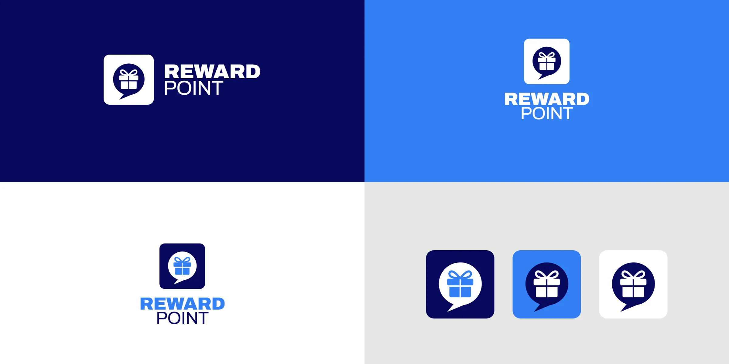
A professional logo is usually delivered as a small family, not one file:
Primary logo: the full version, often a symbol plus the name.
Secondary lockups: horizontal and stacked versions for different spaces.
Symbol or icon: the mark on its own, for app icons, favicons and social avatars.
Colour versions: full colour, one colour, black and white (reversed) for dark and light backgrounds.
That family is still "just" the logo. It tells people who you are, but not how you speak, what your posters look like or which blue to use.
What is a brand identity?
A brand identity is the set of design decisions that makes every touchpoint feel like it came from the same place. It answers the questions a logo leaves open:
Which colours, in which proportions?
Which typefaces for headlines, body text and small print?
What do photos and illustrations look like?
How do layouts work on a poster, a post and a packaging panel?
How does the brand sound in a headline?
One of the most famous proofs that a system matters is the NASA Graphics Standards Manual, issued in January 1976. It didn't just present the "worm" logotype introduced the year before; it described a whole visual communications system, covering publications, vehicle markings and signboards. Decades later it's still studied because it shows identity as a set of rules, not a single drawing.
What a full identity system includes
Every project is different, but a complete identity usually contains these parts.
1. The logo family
Everything listed above: primary logo, lockups, symbol and colour versions, with clear-space and minimum-size rules so the mark never gets crowded or unreadable.
2. Colour palette
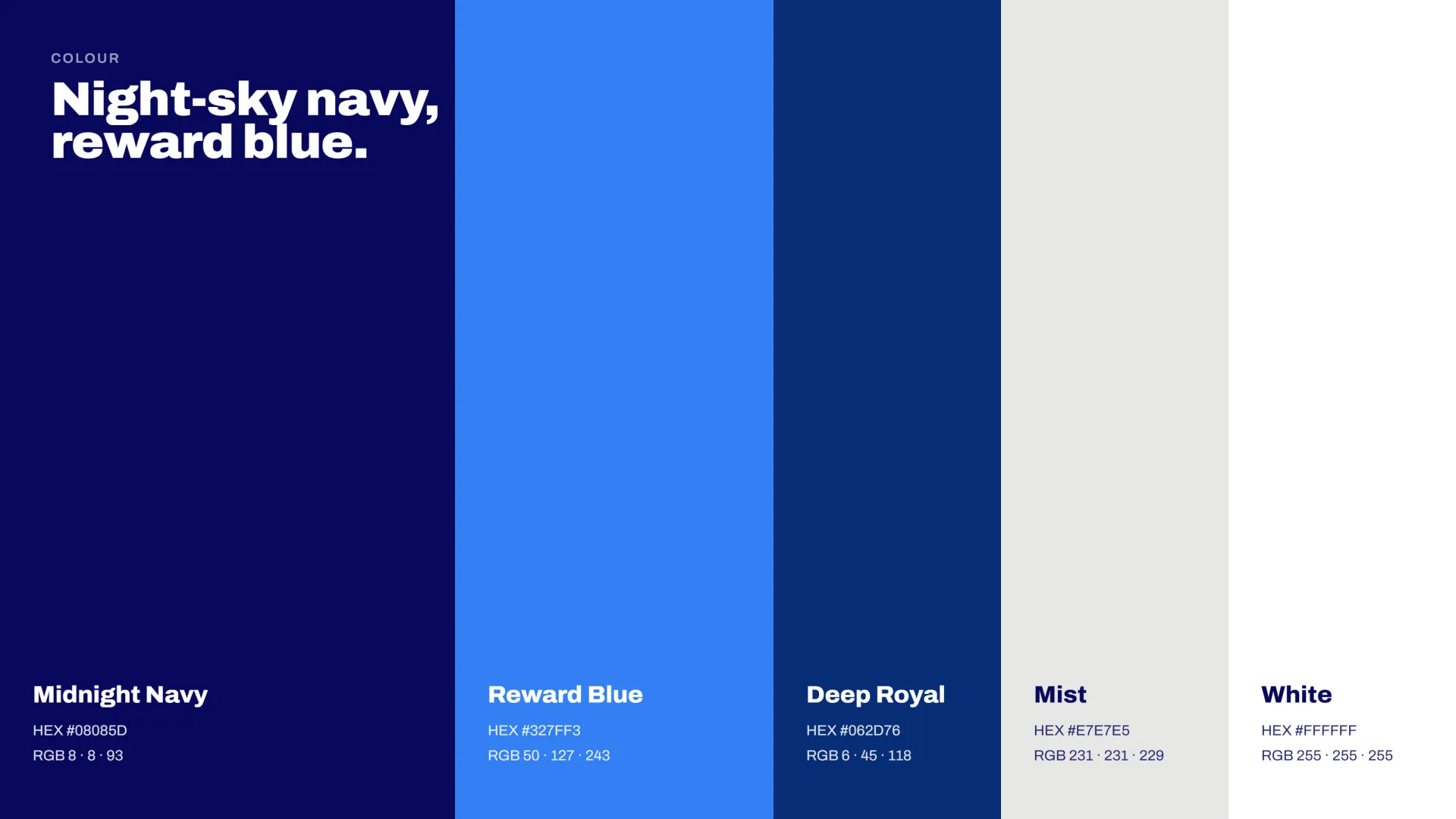
Primary and supporting colours, each with values for screen (HEX, RGB) and print (CMYK, and Pantone when needed). Good palettes also say how much of each colour to use; a brand that is "mostly navy with a touch of yellow" looks very different from one that is half and half.
3. Typography
One or two typefaces with defined roles: display for headlines, text for reading, sometimes a third for numbers or labels. Licensing is part of this decision, because the font has to be usable on the website, in the app and in print, and a desktop license often doesn't cover web or app use (TypeTogether: What is a font licence).
4. Graphic elements
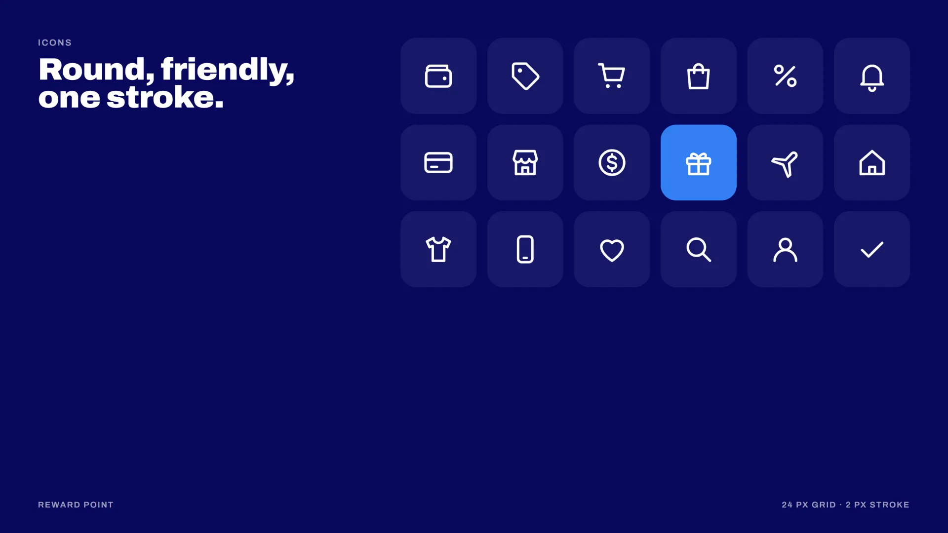
Patterns, shapes, icons, frames, textures. These are what make a brand recognizable even when the logo is not visible. That matters because a logo alone rarely carries a brand: in a 2023 Ipsos study with over 26,000 respondents worldwide, only 19% of the logos tested reached its top level of distinctiveness (Ipsos: Be Distinctive. Everywhere.). For Famous Star Festival, a bilingual identity for a talent festival in Beijing, the mark (two letter Fs drawn as two stage roofs, with a star between them) came with a Chinese and English logo system, a palette taken from Chinese celebration reds and golds, and a pattern, so the festival looked like itself wherever the logo wasn't.
5. Imagery direction
Rules for photography and illustration: lighting, cropping, colour treatment, what to avoid. Without this, every new photographer or freelancer pulls the brand in a different direction.

6. Layouts and templates
Grids and ready-to-use templates for the materials the business produces most: social posts, presentations, posters, menus, email headers. This is where an identity starts saving time instead of costing it.
7. Voice and messaging
A tagline, a few key messages and simple tone rules ("short sentences, no jargon, speak to one person"). Words are part of the identity; the same design with the wrong voice feels off.
8. Brand guidelines
The document that holds it all together, from a short PDF to a full website. Large companies publish theirs openly; reading a few is the quickest way to see how detailed a system can get. The IBM Design Language, for example, covers its typeface, colour, grid, logos, icons, pictograms, illustration, photography, data visualization, layout and animation.
A real example: from mark to campaign
Reward Point, a cashback and deals app, needed more than a mark. The logo, a gift inside a speech bubble, marks the point where every purchase pays you back. Around it I built the app icon, a colour system, typography and a launch campaign. Because the rules came first, every launch visual, from social posts to bus shelters, metro posters and the app screens themselves, could be produced fast and still look like one brand.

When is a logo enough?
A logo alone can be the right call when:
You're testing an idea and need a name on a page this month.
The business has very few touchpoints (a single sign, a business card, one social account).
You plan a full identity later and need a placeholder that won't be wasted.
When do you need a full brand identity?
You need the system when:
Several people or agencies will create materials for you.
You launch on many channels at once: packaging, social, web, events.
You compete in a crowded category where recognition matters more than the name.
You're raising money, entering a new market or rebranding.
Common mistakes
Briefing a logo when you need a system. The logo gets approved, then every new poster becomes a debate.
Treating guidelines as decoration. If nobody uses them, they don't exist. Keep them short and practical.
Choosing colours only on screen. Always check them printed; some bright screen colours can't be reproduced in CMYK.
Forgetting small sizes. Test the symbol at favicon size before you fall in love with the details.
FAQ
Is a brand identity the same as branding?
Not quite. Branding is the broader work of shaping how people perceive a business: strategy, positioning, experience. The brand identity is the visible and written expression of that strategy.
How long does a brand identity take?
In my projects, a logo and small identity has taken about a week, and a full identity system around three weeks. Campaigns and large guideline documents take longer.
Can I add an identity later to an existing logo?
Yes. Many identity projects start from an existing logo that's refined, then extended into a system. Sometimes the logo is fine and only the system around it is missing.
Planning a logo or a full identity? Tell me about your project and I'll tell you honestly which one you need.