Brand identity and launch campaign for a cashback app: a gift in a speech bubble that marks the point where every purchase pays you back.
- Client
- Reward Point
- Year
- 2023
- Role
- Logo & brand identity · Art director
- Services
- Branding
Overview
Reward Point is a cashback and deals app that pays shoppers back a share of every online purchase. I designed its brand identity in 2023: a logo and app icon that had to stand out on a crowded home screen, explain the product at a glance and feel trustworthy enough to hold people’s money.
As art director and designer I created the logo, the app icon, the colour palette, the typography and the first launch visuals, from social media posts to outdoor posters. The app screens and campaign photos on this page are a 2026 presentation of that identity.

The idea
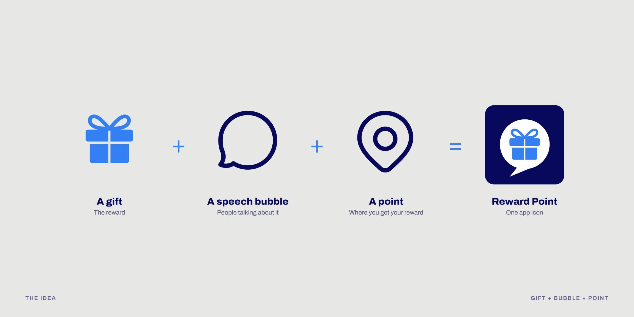
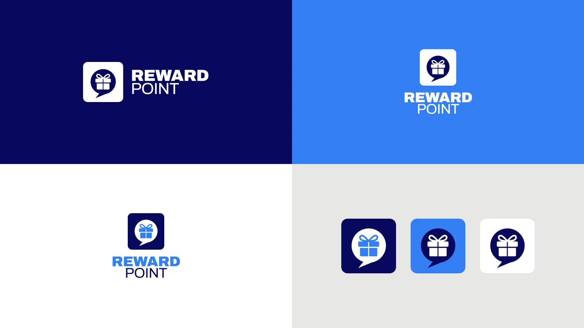
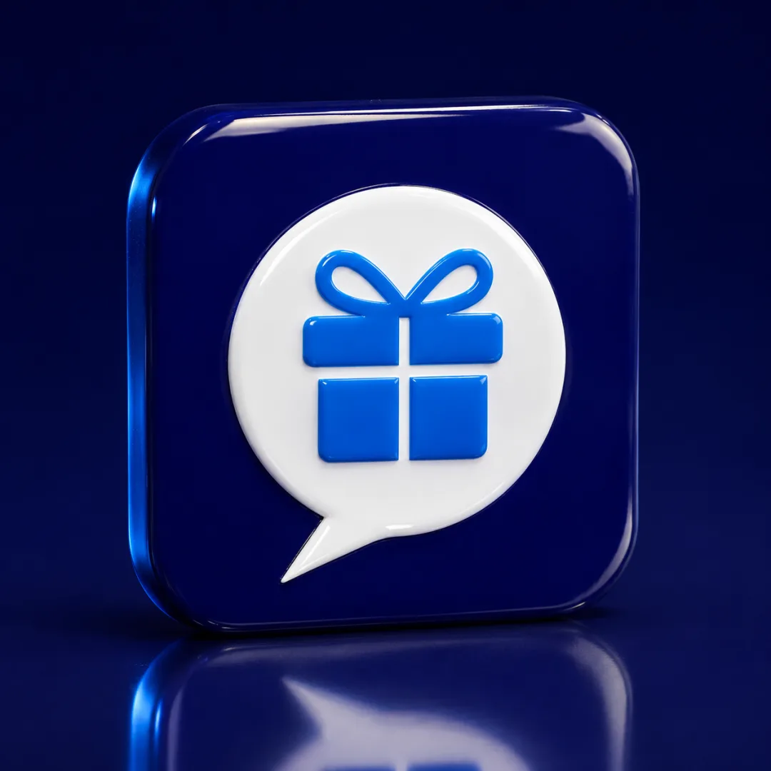
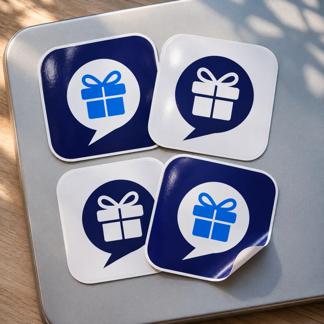
The logo puts the whole product into one app icon. A gift box stands for the reward. It sits in a speech bubble, because good deals are shared and talked about. And the bubble’s tail turns it into a map pin: the point where you get your reward.
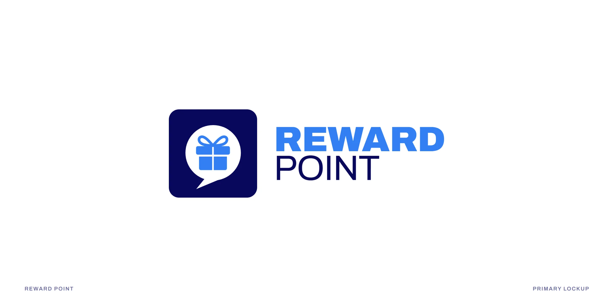
Built on a strict 10 × 10 grid with soft, rounded corners, the icon stays sharp from a tiny notification to a billboard, and the bold, wide REWARD over a calm POINT gives the name the same balance of energy and trust.


The system
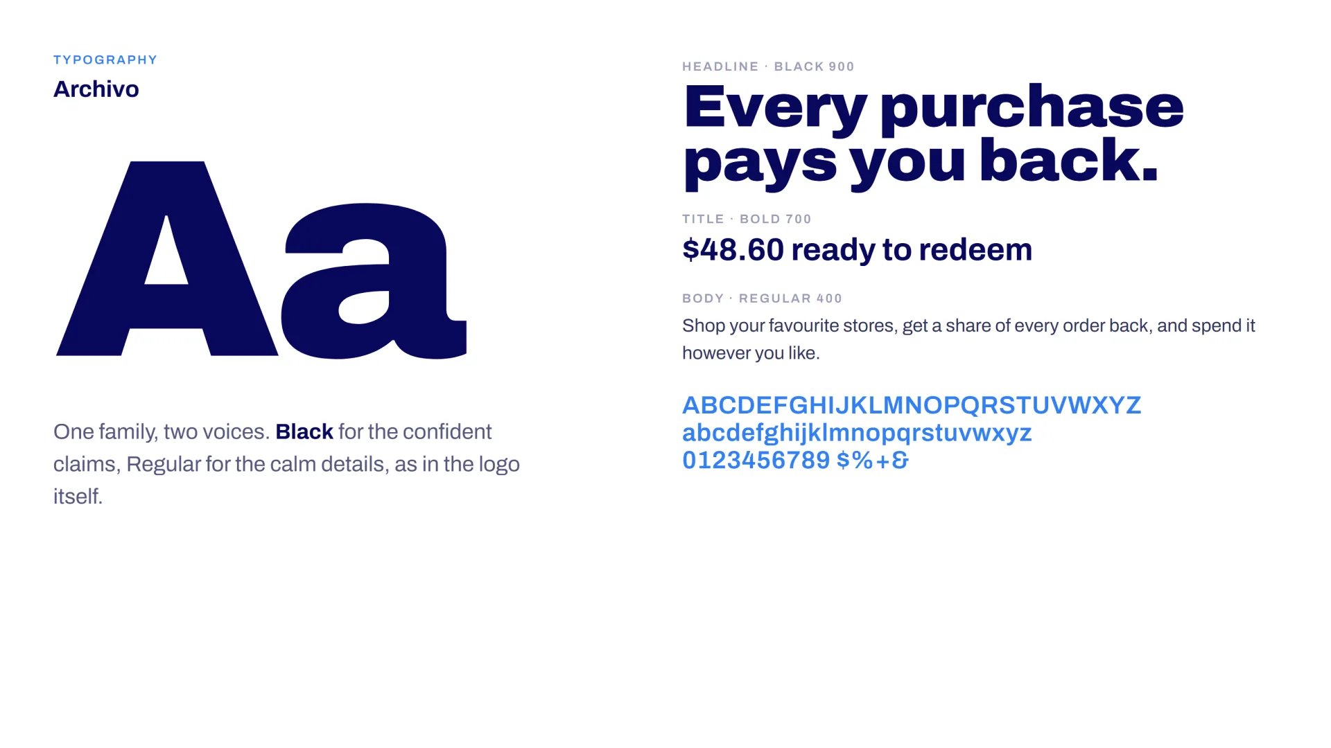
Midnight navy and reward blue carry the fintech brand identity: navy for trust, like a bank; bright blue for the good-news moment of getting money back. Archivo in Black and Regular gives a confident headline voice and clear numbers in the app.
The speech bubble becomes a flexible graphic device that holds cashback amounts, frames images, turns into notifications and shrinks into small “+5%” chips, alongside a set of 18 rounded line icons drawn on the same grid.



Every purchase pays you back.
In the app
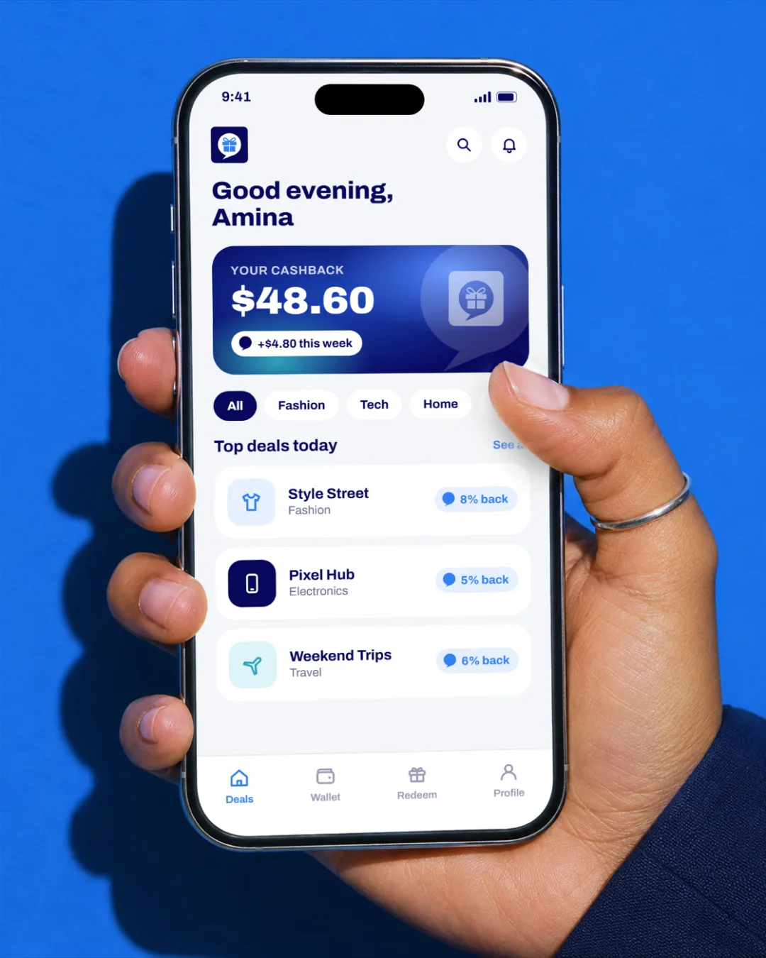
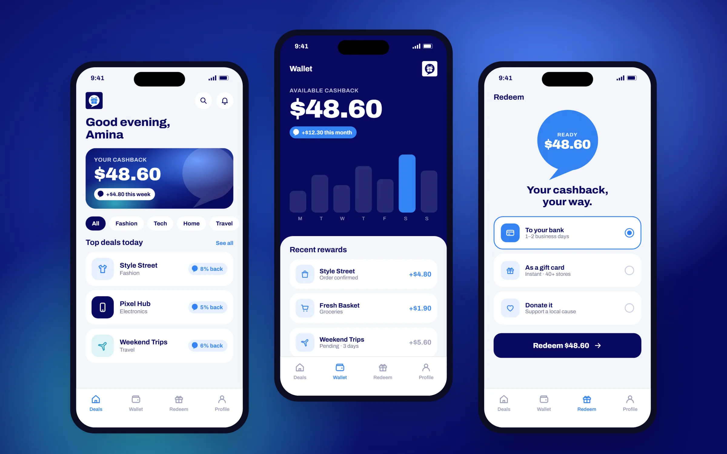
A cashback app lives or dies by one moment: seeing the money come back. The identity is built for that screen.
Deals, wallet and redeem screens (concept designs to show the brand in the product) use the navy for balances, the blue for every reward and the bubble for every amount earned, so the brand and the benefit are the same thing.
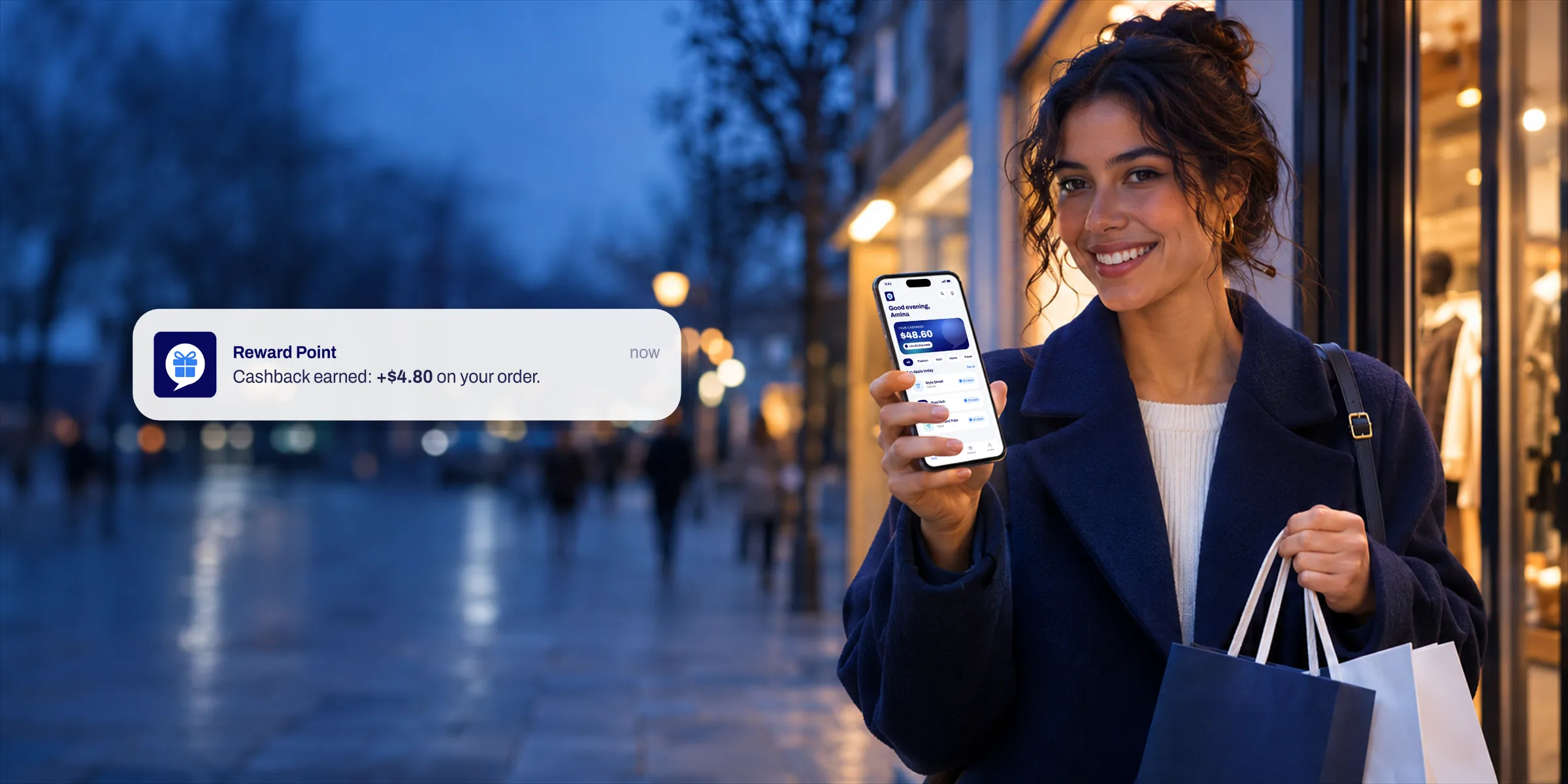
Outside the app, the same bubble arrives as a push notification on the lock screen: a short, friendly “Cashback earned” that brings people back to the product and makes every reward feel like good news.


The launch
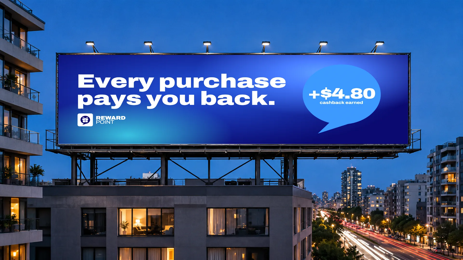
The app launch campaign turns one simple promise into everything people see: Every purchase pays you back.
The same bubble, numbers and navy-and-blue world run across social media posts, a bus shelter, a city billboard, metro posters, gift cards and team merchandise, so every touchpoint feels like the same app.
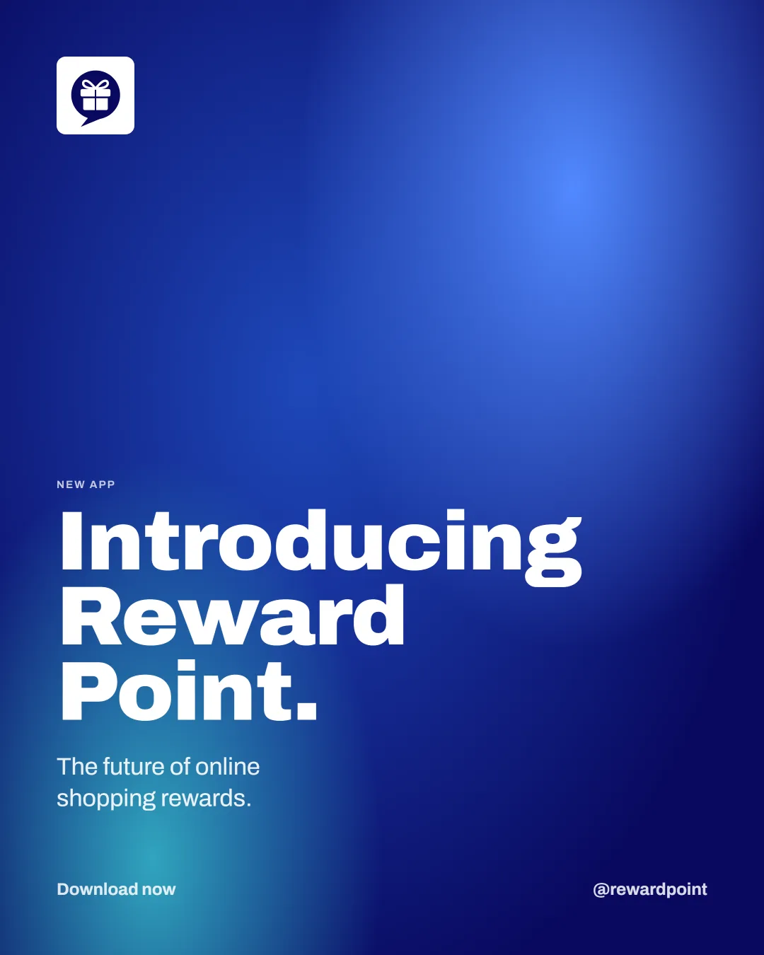


Social media posts


Launching an app or a startup?